
19 Killer Responsive Menu Design List
Full cross-browser compatibility, Fully accessible even when javascript is turned off, as a pure css menu, Search engines optimized, Clear unordered list (LI and UL HTML tags) structure, Easy to setup and update, Fantastic animation and transition effects, Multiple pre-desinded color schemes, Completely customizable styling with CSS, Powered by jQuery,
Extremely small - 3kb uncompressed
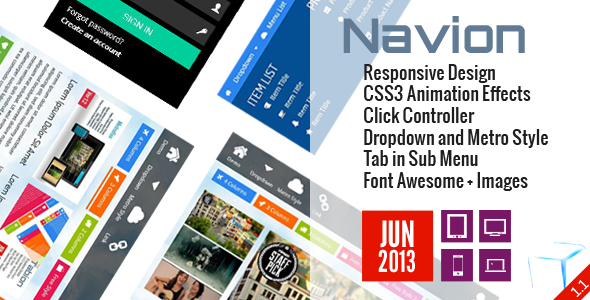
Navion – Metro Navigation Menu Accordion Switcher CSS
Navion – Metro Navigation Menu Accordion Switcher CSS is a small CSS plugin that is used to create navigation menu for modern sites with responsive menu design feature.Responsive Design.Three Main metro style navigation menu Sizes.Sub Menu with Dropdown and Metro Style.Tab in Sub Menu.TileBox – Modern Responsive LightBox CSS
TabLooper – Responsive Loop Tab Metro UI
OneSlider – Responsive Slider With Interactive Content
OneMenu – Responsive Metro UI Menu
Responsive Shop Slider
ScreenSlider – Responsive Touch Presentation
MetroBox – Responsive LightBox
MenuStation – Unlimited Responsive Menu
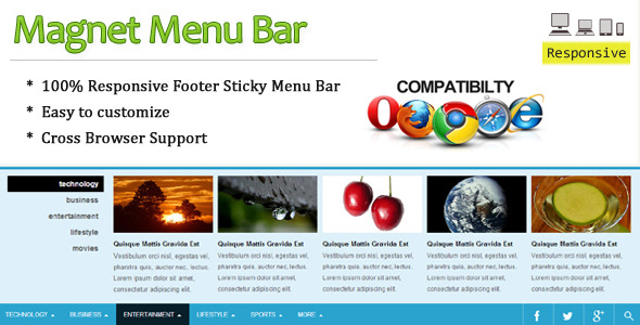
Magnet Menu Bar is a powerful CSS plus Javascript script that is used to create modern navigation menu for any sites with CSS responsive menu feature
Menu default mode
Sample preview one: Onclick menu
Sample preview two: Onclick menu
This menu has been tested (and works !) with all the following browsers :
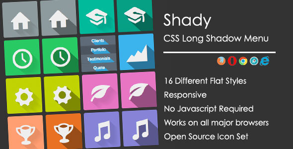
Shady is a Responsive, flat long shadow CSS menu.Responsive design (2 visualizations)
Modern, flat design and long shadows
Responsive 3D Mega drop down Menu (latest ver 1.Responsive 3D Mega Drop Down Menu is a flexible and high customizable to build your custom menus. In addition to you can set up the menu item drop down by clicking or hovering.Responsive Design, support any PC or MAC systems, smartphones and tablets
Click/hover behavior choice on the mega drop menu options page
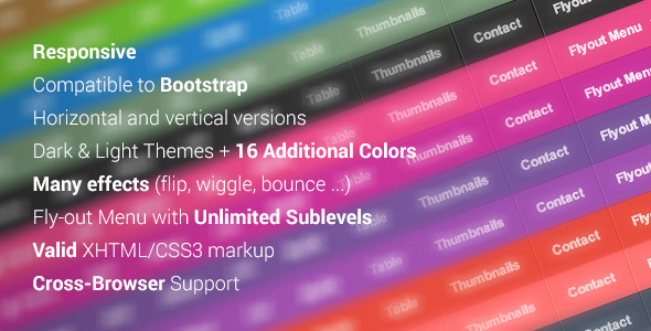
Fly-out Menu with Unlimited Sublevels
This menu has been tested (and works !) in all the following browsers :
Maxx – Responsive Creative Wordpress Theme
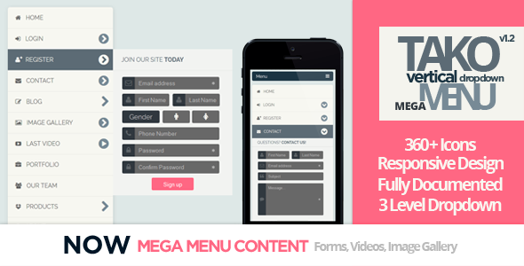
This it’s a menu with 3 columns of pages with a very good design and color combinations and its compatible with mobile devices! Its very efficient for people who want a simple responsive menu with modern design.- We added the Mega-Menu design with the posibility to add forms, images and video in the dropdown!
- Also we added 360+ vector icons to put them in your menu items!
iPhone Responsive Design!
Easy to add new menu items
Clean, Minimal and cool design
Mega-Menu Content:
Responsive Example Gif
- iPhone Portait Responsive Design!
- Mega-menu Content (complete forms, images, video and more!)
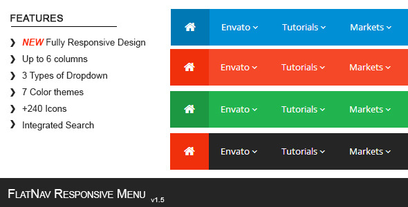
FlatNav is a responsive menu design to organize your website navigation. It comes with different colors to adapt to your site and have a flat design buttons for a modern look. This menu includes more than 240 icons and 3 different type of navigation, you can combine the three types of navigation or use only the one you like. Make your website easy and intuitive to surf with this responsive menu.
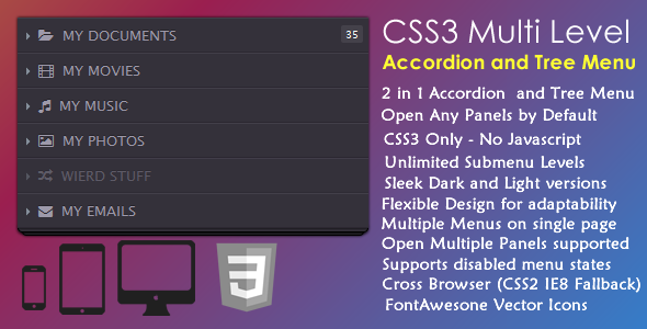
CSS3 Multi-Level Accordion and CSS menu examples is a 2 in 1 – Pure CSS3, no javascript, Well styled menu that allows you to easily create multilevel accordion style menus with unlimited levels – The menu comes with 3 sample menus that include 2 stylish accordion menus in ultra modern beautifully styled dark and light versions plus a multi-level tree menu. The menu is well coded and documented with text shadow CSS3 cross browser support including a CSS2 fallback solution for IE8.2 in 1 Accordion and horizontal menu CSS
Responsive Flexible Design for adaptability
supports Disabled menu states
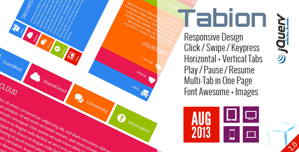
Tabion jQuery – Modern Responsive Tab Accordion
Tabion jQuery – Modern Responsive Tab Accordion is a small jQuery plugin that is used to create modern Tab with powerful features. Supports Responsive Design, Swipe to change Tab Content, Left and Right keys to change Tab Content, Combine AJAX and Inline Content, CSS3 Animation Effects, Integrated Font Awesome, AutoPlay/Pause/Resume and a lot of CSS option to customize…
Responsive Design.Navion – Metro Navigation Menu Accordion Switcher CSS
TileBox – Modern Responsive LightBox CSS
TabLooper – Responsive Loop Tab Metro UI
OneSlider – Responsive Slider With Interactive Content
OneMenu – Responsive Metro UI Menu
Responsive Shop Slider
ScreenSlider – Responsive Touch Presentation
MetroBox – Responsive LightBox
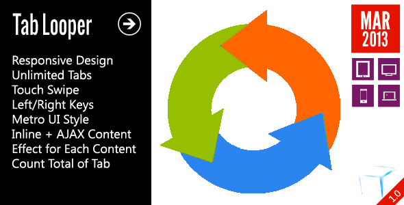
TabLooper – Responsive Loop Tab jQuery
TabLooper is a responsive tab jQuery Plugin that is used to create tabs for your sites with responsive layout, support unlimited tabs, combine inline and AJAX content for best performance, move tab content by jQuery touch gallery event ( on mobile devices ) or left/right keys ( on desktop/laptop ) or simple click on buttons ( all devices ).Responsive Design
Navion – Metro Navigation Menu Accordion Switcher CSS
TileBox – Modern Responsive LightBox CSS
OneSlider – Responsive Slider With Interactive Content
OneMenu – Responsive Metro UI Menu
Responsive Shop Slider
ScreenSlider – Responsive Touch Presentation
MetroBox – Responsive LightBox
MenuStation – Unlimited Responsive Menu
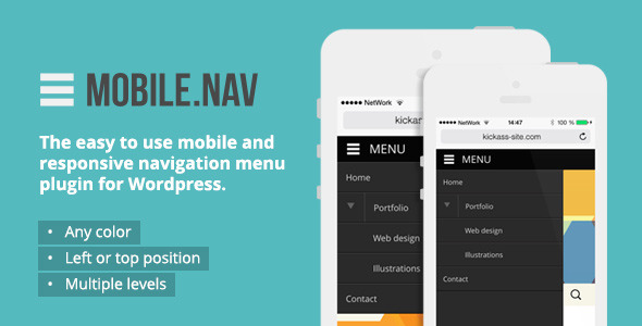
NAV – The easy to use mobile and responsive navigation menu jQuery plugin for Wordpress
• Uses Wordpress built-in design language (you feel at home right away, no new controlpanel to learn all over again)
• Integrates with dropdown CSS menu system
• Supports expanding menu tree (from wordpress menu responsive system)
• Installs under Wordpress standard «Settings» menu
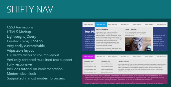
Shifty Nav is a fully responsive CSS3 mega menu. To change the color of the entire menu requires a simple changing of a few pre-defined variables, so there’s not extensive digging through the code!
This menu supports whatever kind of content you throw at it, and includes a full tutorial on how to build the markup for your own menu if you don’t want to modify the pre-existing file. Created with a very modern and metro design.Completely customizable menu layout
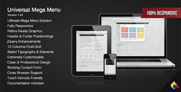
This menu is the result of a combination of my best works on Codecanyon : I’ve put together a flexible mega menu system that can hold 12 sizes of drop downs, unlimited fly-out elements combined with a jQuery script to enhance the whole system. It can be used as a sticky footer (with mega “drop-ups”) using the exact same markup as the “standard” mega menu. Customizing the menu require some basic knowledge of CSS and you can change the look of every part of the menu : the fonts, the colors, the sizes, etc. Fully Responsive Menu
Clean and Professional Design
Standard Top Menu
Sticky (or fixed) Top Menu
Responsive or Non-Responsive
The package contains 2 folders : “Responsive” and “Non-Responsive” so the menu is ready to be included on any type of website. For each version of the menu, responsive and non-responsive, you have 6 HTML files with various examples of what you can do with the menu, from a simple navigation bar without drop downs to a combination of 2 mega menus on a same page. This menu has been tested on many devices and browsers to ensure a maximum compatibility : Internet Explorer, Firefox, Chrome, Opera, Safari have successfully passed the tests.The whole menu relies mainly on CSS, it means that if Javascript is disabled, most of the menu will work. Be sure to test the demo with different browsers or devices to make sure that the menu meets your requirements.I try to regularly update my products based on the feedback I receive, so if you find any kind of bug, I’ll do my best to update the menu as soon as possible. I’ve also created a website that compares and filters my different menus by options / features, Mega-Menu. If you’re still not sure about the menu that would fit into your project, you can contact me at any time from my profile page.
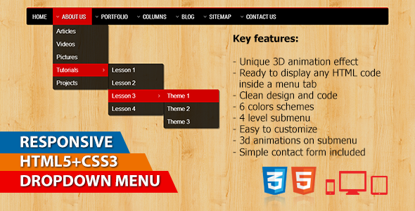
This drop menu code is pure CSS3 accordion menu code.Ready to display any HTML code inside a CSS3 vertical menu
Clean design and code
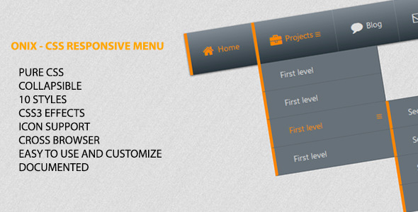
“Onix – CSS Responsive Menu” is a navigation component based in pure CSS. This menu uses gradient colors and CSS techniques to provide a beautiful design. It is a responsive menu plugin component and can be used in various website types.
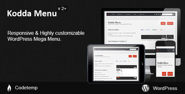
Kodda is a responsive , modern , clean & highly customizable
WP menu. I love the new Kodda menu! It completely changed the look and feel of my website and the upgraded control panel could not be better! iclickandhost.the slider wordpress plugin menu, it also works in multisite over its developer and very friendly and helpful, I recommend toutunservice.Thank you for helping me quickly to install the menu.I bought another menu before but it was too complex to resolve -
Your menu is very well done and easy to adjust
Tout fonctionne !!! Je vous remercie pour m’avoir aidé pour l’installation du Menu .J’avais acheté un autre menu avant mais il était trop complexe à régler – Votre menu est très bien fait et rapide à régler.Much better responsive system
Ability to add background images to menu & submenus
Font awesome icons for ( arrows , search & responsive menu )
Fully Mobile-Ready design adopts to any device !
Ability to change the size and color of the arrows , search & responsive menu Icons !
You can add different menu types
Anything you added to a Menu Type [ Text/HTML ] ,
- Kodda Menu : Fixed re-size & sticky menu issues
- Kodda Menu : CSS & Responsive Enhancements
- Kodda Menu : * Menu Position ( General Style Tab ) replaced by
"Enable Sticky Menu ( Settings Tab )"
- Much better responsive system . - Ability to add background images to menu & submenus
- Font awesome icons for ( arrows , search & responsive menu )
- The menu now , use the wordpress jQuery dropdown menu version only
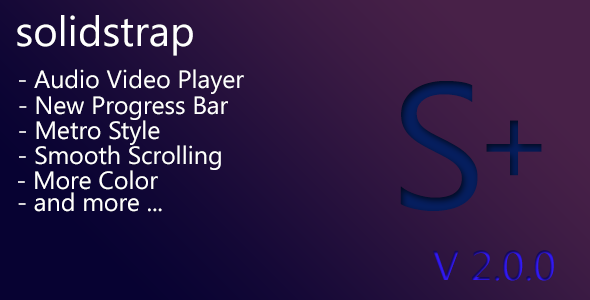
Solidstrap is custom mod bootstrap with metro design and style,
– mejs-solid ( blue with metro look design )
– mejs-grade ( gradient dark sleek and smooth design )
3 navbar skin : navbar inverse, navbar default and navbar white with custom design.- totally change for navbar menu style css command
- add custom dropdown menu color
net/item/fw-responsive-pricing-table/4785929
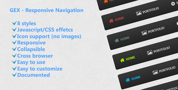
“GEX – Responsive Navigation” is a navigation component based in Javascript and CSS. This menu uses gradient color and Javascript effects to provide a beautiful design. It is a CSS responsive menu component and can be used in various website types.
20. Clean CSS3 Menu
This Clean CSS3 Menu is a flexible and easy to integrate solution to build your custom menus. The Menu relies only on CSS3 and HTML. This accordion menu design is fully Responsive